Bedroom
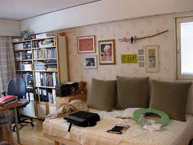
Our bedroom now looks like this, what you see in here is how I like crisp white with old 50's to 70's furniture.
 |
| Taken from window side |
 |
| Taken from the right side of the bed |
 |
| Taken from the doorway |
I'm more or less happy about our bedroom. I would like to change the wallpaper, but this will do, it's light in colour anyway. I do like the mirrored closets by the door and I love that old dark shelf on the foot of the bed. I also love the bedspread and the old sewing machine/table. The bed itself is comfortable too.
My dream bedroom would actually be a japanese style bedroom, with tatami floor and futon bed and with no or limited furniture, something like in this picture. But I know it will not work, where would I have my clothes and futon beds are quite hard, I do need something softer and I would not be excited to vacuum the room every other day. Also A is not very good in kneeling down, he always complains when there is a task that reguires bending down. I'm ok with that, I do most things on the floor level anyhow, I've never really learned how to use a table.
I'm planning to make a headboard so I'll need some headboard inspiration. I will make a very plain and minimalistic headboard, it's most likely going to be made from wood, covered with cushioning and white fabric. I really like this tufted headboard, but A was not that into it, he said that the covered buttons made it look old fashioned. It is weird that sometimes he has very strong opinions about decor. There is also this funky headboard that really makes me smile, but to me it looks like the corners of the pillows are going to rip when I'll lean on them. But maybe this headboard made of squares could be the headboard I can make.
Our bedside tables could also be smaller. The existing ones are dark colour and too wide. Lot of things fit inside there offcourse which is good. But on the other hand not that many things are needed to be stored there.I do like this bedside table shown in the Chez Larsson blog. But I do need sometype of door or drawer to it. All our stuff is not as nice looking as in Larsson residence.
| From Chez Larsson |
The office is the room I'm least happy about, it has no style, it's a mix of all things we used to have in our previous homes that we no longer like. This is a big room and perhaps because of that it collects all kinds of clutter from the other rooms. There is a guest bed in the office and that especially is a clutter magnet. There is also a armchair which has always something on top of it, so there is no chance of ever sitting on it, the chair is also very electric, I always get a electric shock after I leave it.
 |
| Taken from window side |
 |
| Taken from doorway, here you see the guest bed and A's side of the office and his shelf |
 |
| Taken from foot of the bed, here you see the armchair and my side of the office |
What I would need is a place to do sewing and crafts. The guest bed is hardly ever used. And the shelves on the office are packed and busy looking, those could use some doors. I also really dislike the floral wallpaper. I do want to incorporate the colour white to our office more. The office table is the wrong colour of wood, I'd like it to be white or dark wood. I hate my office chair, it is just too plastic looking. I would love something like this toledo stool. I would enjoy Chez Larsson look in our office too.
| From Chez Larsson |
What I can do is paint the shelves and that chest of drawers, I can make new cover for the armchair, so it will look similar to this, and I could change the wallpaper if I'm up to it. I could also get doors to the shelves, which are very old Finnish design and luckily still in production.
Determining my style
In words I would say my style is simple, crisp and combines of the midcentury modern and organic modern, defined in the AT, the eight-step home cure book by Maxwell Gillingham-Ryan.Organic modern is said to be asian influenced, and I do like asian style, but I would go without all that bambu. Midcentury modern then uses elements of the Californian and Danish, like molded plywood and prefab houses. I do like plywood and prefab houses look nice to me. What I would incorporate to this style is also some Finnish design. For example these mugs or this shingle bag or this what I call a Cleopatra lamp.

I love those headboard inspiration pics! especially the one made of little pillows clipped together. that's just the kind of creative thing that really appeals to me.
ReplyDeleteIs it possible to replace the wallpaper in the office? or is that too much for this time around?
Love all the white in your rooms!
I'd love to change the wallpaper, but maybe not during the hybrid cure. I just don't have the time. But it's definetly something I'll do sooner or later.
ReplyDeleteI love the pillowed headboards--I think your plan of making smaller squares is more practical, however--and it will still be unique. Love the toledo stool, too.
ReplyDeleteSounds like you have some great plans--and I'm sure you are going to be much happier.